Common Dashboard Design Mistakes
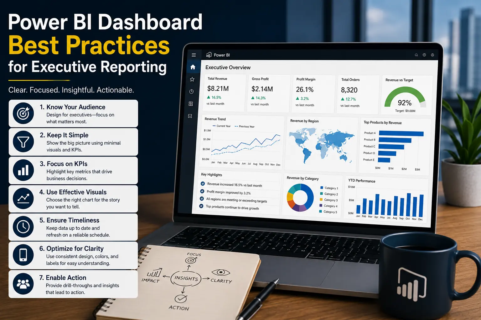
Dashboard design best practices are not about decoration. They are about helping business users understand performance quickly, trust the numbers, and know where action is needed.
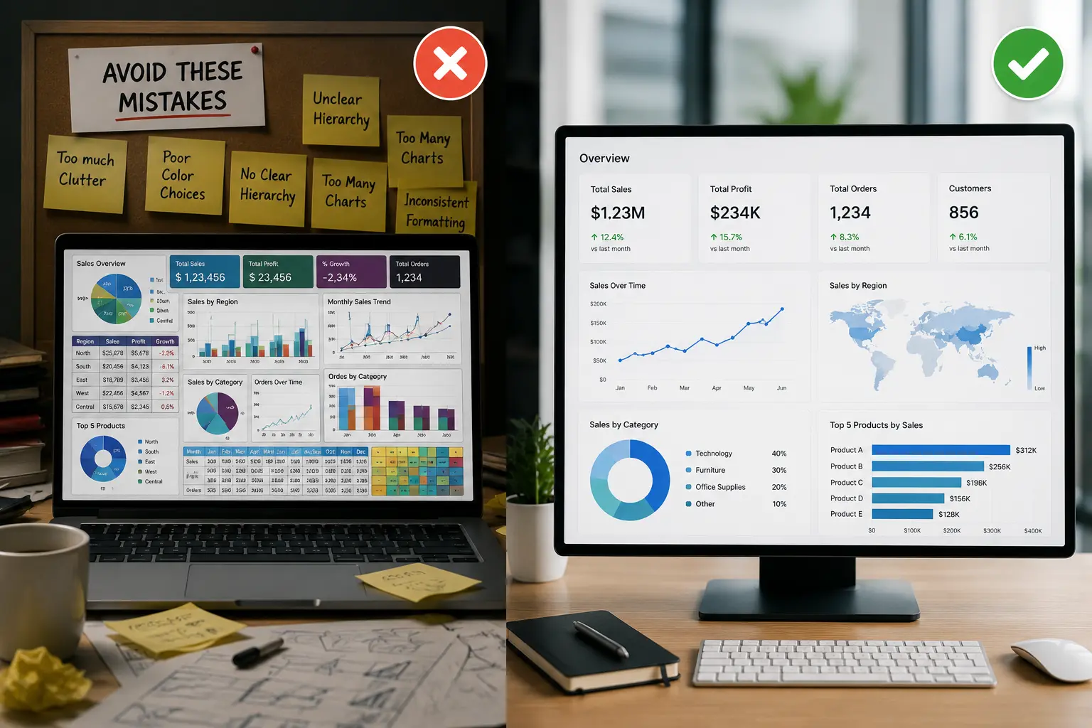
Dashboard design best practices start by avoiding these mistakes
1. Building the dashboard before defining the audience
A dashboard for an owner is different from a dashboard for a warehouse manager. If the audience is unclear, the dashboard becomes a compromise that serves nobody well. Define the user, the decision, and the reporting cadence first.
2. Putting too many visuals on one page
Crowded dashboards slow users down. They also make the report harder to maintain and can hurt Power BI performance. Use the first page for summary and exceptions. Move detail to supporting pages.
3. Showing KPIs without targets
A number without context is hard to interpret. Revenue, backlog, close rate, labor cost, and margin all need a target, budget, trend, prior period, or threshold to explain whether performance is acceptable.
4. Using unclear KPI definitions
If sales means invoiced revenue in one report and booked orders in another, users will lose trust. KPI definitions should be documented and reused through governed models where possible.
5. Treating charts as decoration
Every visual should answer a business question. If a chart does not clarify performance, show a trend, compare segments, or identify an exception, it probably does not belong on the dashboard.
6. Overusing slicers and filters
Too many slicers force users to configure the report before they get value. Choose filters that match business workflow, such as date, location, product group, customer segment, or department.
7. Ignoring mobile or meeting-room use
Dashboards used in leadership meetings should be readable on shared screens. Dashboards used by field managers may need mobile-friendly layouts. Context matters.
8. Hiding data quality issues
A dashboard can look polished while the underlying data is incomplete or inconsistent. If users question the numbers, address the data process before adding more visuals.
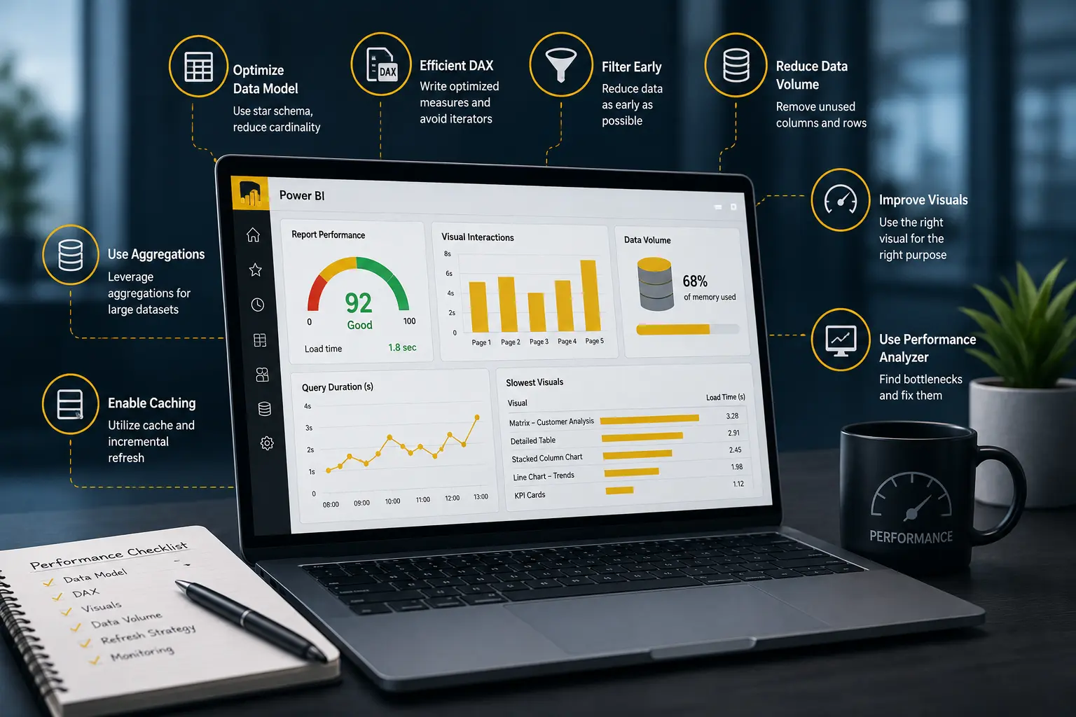
9. Ignoring report speed
Slow dashboards lose adoption. Model design, visual count, DAX complexity, DirectQuery use, and source system performance all affect load time. Our guide to optimizing slow Power BI reports covers common fixes.
Dashboard mistakes and better alternatives
Practical business examples
Finance dashboard mistake
A finance dashboard shows revenue, expense, profit, cash, receivables, and budget data, but every page uses different date filters. Leaders cannot reconcile the numbers. The fix is a consistent date model, clear period selection, and documented measures.
Operations dashboard mistake
An operations dashboard lists every job and ticket on the first page. Managers spend time scrolling instead of identifying bottlenecks. The fix is a summary page with backlog, aging, on-time performance, and exception lists that link to detail.
Sales dashboard mistake
A sales dashboard shows pipeline value but not probability, stage age, close date quality, or win rate. The number looks promising but does not support forecasting. The fix is to add context that explains pipeline quality.
How to fix a dashboard that is not working
Start by interviewing the actual users. Ask which meetings use the dashboard, which questions it should answer, which numbers are disputed, and which pages are ignored. Usage feedback is often more valuable than another round of visual changes.
Next, review the data model. Many dashboard design problems are really model problems. If measures are duplicated, relationships are unclear, or transformations happen in several files, the dashboard will be hard to improve. A better model supports cleaner visuals.
Finally, simplify the layout. Put the most important KPIs first. Use trends and exceptions. Remove visuals that do not support a decision. Create drillthrough or detail pages for deeper investigation.
If dashboard issues are part of a larger rollout, review our posts on Power BI implementation challenges, Power BI governance, and Power BI security.
If the dashboard needs to be rebuilt rather than lightly adjusted, our article on Power BI dashboard development services explains what a professional engagement should include.
Need dashboards that are easier to use?
Willduet helps SMBs with Power BI dashboard development, reporting automation, KPI reporting, optimization, and implementation support.
Conclusion: dashboard design best practices
Dashboard design best practices help businesses avoid reports that are crowded, slow, unclear, or unused. The best dashboards are built around a specific audience, clear KPIs, reliable data, meaningful targets, simple layout, and practical paths to detail. When design, data modeling, and governance work together, dashboards become tools for action rather than another reporting burden.
Frequently asked questions
What are the most common dashboard design mistakes?
Common mistakes include too many visuals, unclear KPIs, missing targets, poor layout, weak data definitions, too many filters, slow performance, and no clear audience.
How do you make a dashboard easier to read?
Start with the main decision, limit the page to important KPIs, use consistent formatting, show trends and targets, and separate summary views from detail pages.
Why do business dashboards fail?
They fail when users do not trust the data, cannot understand the layout, cannot find the answer they need, or must wait too long for the report to load.
Should dashboards include every metric?
No. A dashboard should focus on metrics that support a specific audience and decision. Extra metrics can be placed on detail pages or separate reports.
Can dashboard design affect Power BI performance?
Yes. Too many visuals, heavy tables, complex interactions, and inefficient measures can make Power BI dashboards slow.
When should a business hire dashboard development help?
Consider help when dashboards are slow, confusing, not adopted, or built on inconsistent data models and manual reporting processes.