Power BI Dashboard Best Practices for Executive Reporting
Executive dashboards should help leaders understand performance quickly, ask better questions, and decide where to focus. These Power BI dashboard best practices keep reporting clear, fast, and trusted.
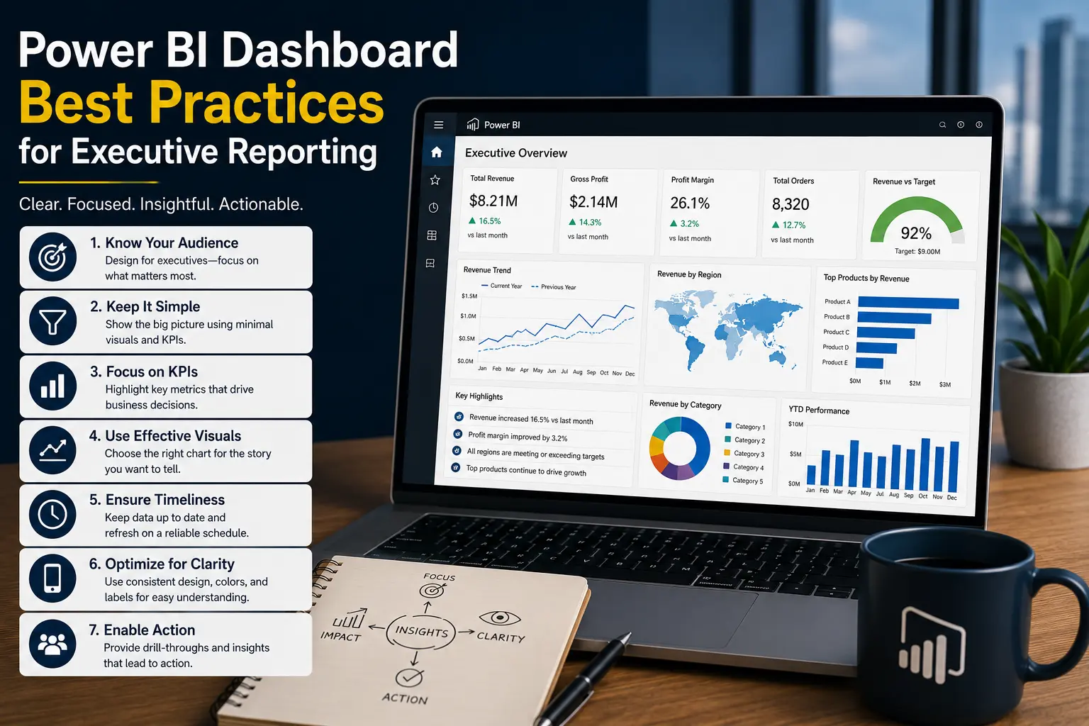
Power BI dashboard best practices start with purpose
A Power BI executive dashboard is not a data dump. It is a decision tool. The first question should be: what should leadership understand or do after reviewing this dashboard? If the answer is unclear, the dashboard will become a collection of charts instead of a management system.
Executive reporting usually needs three things: a clear view of current performance, context for why performance changed, and a path to investigate exceptions. A CEO may need company-level KPIs. A CFO may need margin, cash, and variance. An operations director may need backlog, service levels, and risk indicators.
Power BI dashboard best practices for executive reporting
1. Start with business questions, not visuals
Do not begin by choosing chart types. Begin with decisions. What does leadership review weekly or monthly? Which numbers trigger action? Which exceptions need escalation? The dashboard should match that conversation.
2. Use a small set of meaningful KPIs
More metrics do not automatically create better visibility. A strong executive dashboard may focus on revenue, margin, cash, pipeline, delivery performance, customer retention, or operating capacity depending on the business. Each KPI should have a clear definition and owner.
3. Show trend and comparison
A single number is rarely enough. Executives need to know whether performance is improving, declining, ahead of plan, behind budget, or outside normal range. Use prior period, target, budget, forecast, or year-over-year comparisons when they support the decision.
4. Design the page for scanning
Leadership dashboards are often reviewed quickly. Put the most important KPIs at the top. Use consistent formatting. Avoid visual clutter. Make exception areas easy to find. Do not force users to decode colors or hunt for the main message.
5. Use drill paths instead of crowding the main page
Executives need summary first, but they also need a way to investigate. Use drillthrough pages, detail pages, tooltips, and filters so users can move from company-level performance to region, product, customer, sales rep, or department.
6. Optimize performance before launch
Slow executive dashboards are adoption killers. Reduce unnecessary columns, use a clean model, limit visuals, avoid oversized tables, and test important pages. If the report is slow, review the guidance in our article on how to optimize slow Power BI reports.
7. Control security and sharing
Executive dashboards often include sensitive finance, sales, customer, or operational data. Use workspaces, apps, audiences, row-level security, and export rules intentionally. Test what different users can see before launch.
8. Document KPI definitions
A dashboard loses credibility when people argue about what a metric means. Document definitions, source systems, filters, refresh timing, and known limitations. This is especially important for revenue, margin, pipeline, churn, and operating capacity.
Good vs weak executive dashboards
Practical executive dashboard examples
Finance dashboard
A finance dashboard might show revenue, gross margin, expenses, budget variance, cash position, accounts receivable, and forecast. The best design starts with summary KPIs and gives finance leaders a path to investigate product, department, customer, or region.
Operations dashboard
An operations dashboard might show backlog, cycle time, fulfillment volume, on-time delivery, quality issues, utilization, and capacity. The main page should highlight exceptions, not every transaction.
Sales dashboard
A sales dashboard might show pipeline, bookings, win rate, forecast, sales cycle, quota attainment, and stalled opportunities. A strong model avoids confusing booked revenue, invoiced revenue, and forecasted revenue.
If these dashboards depend on repeated manual exports, read our guide on automated business reports. If the data comes from many systems, compare whether your company needs a database or data warehouse for cleaner reporting foundations.
Governance best practices for executive dashboards
Executive dashboards need governance because the reports influence important decisions. Governance does not need to slow the business down, but it should make ownership clear. Someone should own each KPI, each data source, and each production report.
A simple governance model includes a production workspace, controlled publishing, documented metric definitions, app-based distribution, and a process for requesting changes. Without this, leadership may end up with multiple dashboards that answer the same question differently.
Define report ownership
Ownership should include both a business owner and a technical owner. The business owner validates the meaning of the metrics. The technical owner maintains the model, refresh, access, and report performance. This split prevents the common problem where IT owns the report technically but nobody owns the business definition.
Control production changes
A dashboard used in leadership meetings should not be changed casually. Use a development copy for updates, test the numbers, confirm security, and communicate changes before publishing to production. This is especially important for finance, board reporting, and operational dashboards used for daily management.
How to make executive dashboards part of the management rhythm
A dashboard is more useful when it is connected to a meeting cadence. Weekly operations reviews, monthly finance reviews, sales pipeline meetings, and executive scorecards all benefit from consistent reporting. The dashboard should support the agenda instead of forcing leaders to interpret a new layout every time.
For example, a monthly executive review might start with company KPIs, move to revenue and margin trends, review exceptions, and end with owners for follow-up actions. The Power BI report should follow that flow. If users need to export data into a separate deck every month, the dashboard may not be aligned with the real process.
Adoption also improves when leaders trust refresh timing. If a Monday morning dashboard includes data through Sunday night, say that clearly. If finance numbers are only final after month-end close, do not present preliminary numbers as final.
Testing executive dashboards before launch
Executive dashboards should be tested with the same seriousness as other business systems. Before launch, validate totals against trusted sources, confirm filters behave correctly, check row-level security, test refresh timing, and review performance on the pages leaders will use most.
Testing should include business validation, not only technical validation. If the dashboard shows revenue, finance should confirm the number. If it shows backlog, operations should confirm how backlog is defined. If it shows sales pipeline, sales leadership should confirm stage logic and exclusions.
It also helps to run a pilot meeting with the dashboard. Ask leaders to use it as they would in a real review. Where do they pause? Which metric creates confusion? Which drill path is missing? Which visual does not support a decision? This feedback is more valuable than abstract design opinions.
After launch, monitor usage and questions. If executives keep exporting to Excel or asking for screenshots in a slide deck, the dashboard may need to align better with the real workflow.
Executive dashboard launch checklist
- Are the top KPIs tied to specific executive decisions?
- Have KPI definitions been approved by the right business owners?
- Does the first page show summary, trend, comparison, and exceptions?
- Are detail pages available without crowding the executive view?
- Has performance been tested with realistic filters and data volume?
- Have access, export rules, and row-level security been validated?
- Does the dashboard match the meeting or review process where it will be used?
This checklist keeps the dashboard focused on decision support. It also gives leaders and BI teams a shared definition of readiness before the report becomes part of recurring management reviews.
The result is a dashboard that supports the operating rhythm of the company instead of becoming another report people open only when someone asks for it.
This is the difference between a visual report and a management tool. A visual report shows data. A management tool helps leaders understand what changed, why it matters, and where the business should focus next.
That clarity is what turns dashboards into recurring decision support.
Conclusion: Power BI dashboard best practices
Power BI dashboard best practices come down to business clarity, trusted data, thoughtful design, performance, and adoption. Executive dashboards should not overwhelm leaders with every available field. They should show what matters, explain what changed, and help the business decide what to do next.
WillDuet helps organizations design Power BI dashboards, build reliable models, automate reporting, optimize slow reports, and create executive reporting that business leaders can use with confidence.
Need executive dashboards your team can trust?
WILLDUET helps businesses build Power BI dashboards for leadership, finance, operations, and BI teams.
Frequently asked questions
What makes a good executive Power BI dashboard?
A good executive dashboard shows the most important KPIs clearly, explains performance changes, supports drilldown, loads quickly, and uses trusted definitions.
How many KPIs should an executive dashboard include?
There is no fixed number, but fewer meaningful KPIs are usually better than many shallow metrics. Start with the decisions executives need to make.
Should executive dashboards include detailed tables?
Detailed tables should usually be placed on drillthrough or detail pages. The executive view should prioritize summary, trends, exceptions, and context.
How often should executive dashboards refresh?
Refresh frequency should match the business decision. Daily may be enough for management reporting, while operations dashboards may need more frequent updates.
Why do executive dashboards fail?
They often fail because KPIs are unclear, pages are crowded, data is not trusted, reports are slow, or the dashboard does not match the leadership workflow.
Do executive dashboards need row-level security?
They may need row-level security if different executives or managers should see different regions, departments, business units, or sensitive financial data.