Power BI Reports vs Dashboards
Power BI reports and dashboards are often discussed as if they are the same thing. For business leaders, the more useful question is which format helps each audience monitor performance, investigate issues, and make decisions.
Power BI reports vs dashboards: the practical difference
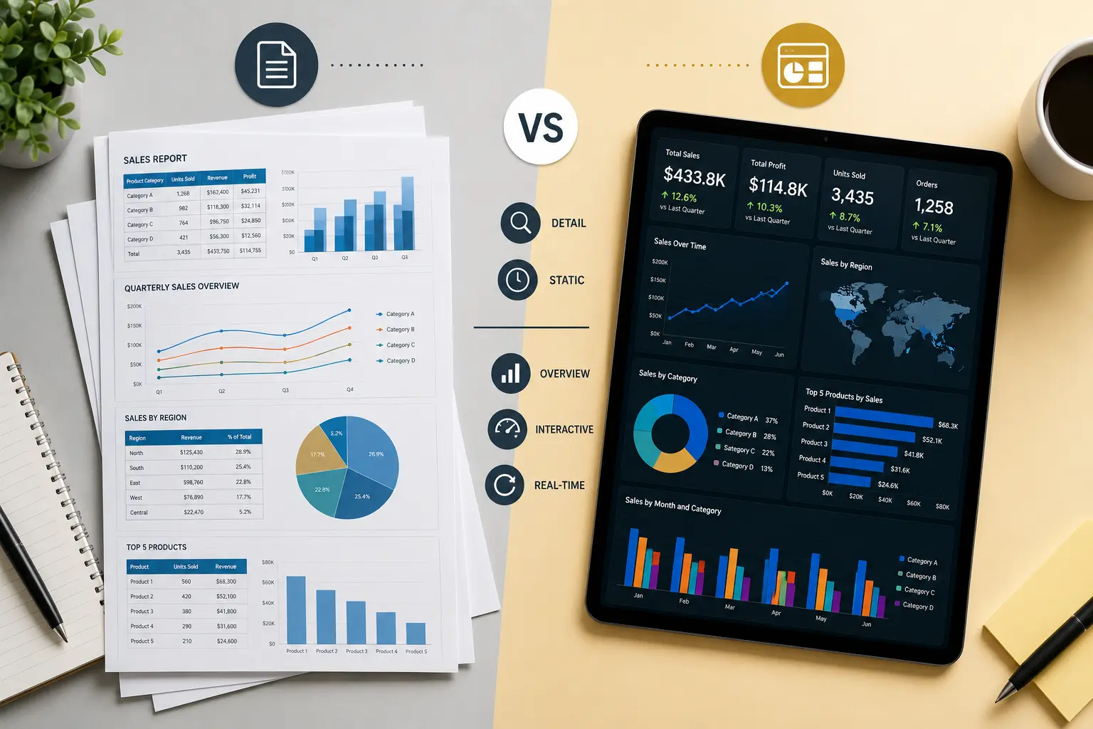
A Power BI report is usually an interactive, multi-page experience built on a dataset or semantic model. Reports are useful for analysis because users can filter, drill, compare, and move between pages designed for different questions.
A dashboard is usually a high-level monitoring view. It focuses on summary metrics, trends, alerts, and exceptions. In business language, many companies use “dashboard” to mean any concise reporting page, even when it is technically built as a Power BI report page.
That terminology is less important than the design decision. Executives need a fast summary of business health. Managers need enough detail to understand why performance changed. Analysts need flexible report pages that let them investigate patterns. A good Power BI implementation supports all three without duplicating metric logic.
When to use Power BI reports
Use reports when users need to analyze data, filter by business dimensions, drill into detail, compare time periods, or move through a workflow. Reports are well suited for department managers, finance analysts, sales operations, and operational teams.
- Monthly financial review with multiple pages for revenue, margin, expenses, and cash.
- Sales performance analysis by rep, territory, product, and customer segment.
- Operations reporting with detail pages for locations, exceptions, and service levels.
- Customer reporting with retention, complaints, usage, support volume, and churn risk.
Reports are also the right place for detailed tables, drillthrough pages, diagnostic views, and manager-level analysis. If a user regularly asks “why did this happen?”, a report is usually needed.
When to use dashboards
Use dashboards when the audience needs fast monitoring rather than deep analysis. Dashboards work well for executives, owners, department heads, and teams that need to see whether key metrics are on track.
- Executive reporting across revenue, margin, cash, pipeline, and operations.
- Daily KPI monitoring for service levels, backlog, or delivery exceptions.
- Leadership scorecards for targets, trends, and red flags.
- Board or investor reporting where clarity and consistency matter more than exploration.
Dashboards should not try to answer every question. They should make the most important performance signals visible and direct users to the right report page when they need detail.
Reports vs dashboards comparison
SMB examples: choosing the right format
Finance reporting
A CFO may need an executive dashboard showing revenue, margin, cash, and budget variance. The finance team may also need a report with pages for account detail, department expense, customer profitability, and aging analysis.
Sales reporting
The owner may need a dashboard showing bookings, pipeline, win rate, and forecast risk. Sales managers may need reports with rep performance, territory detail, lost deals, and customer segment analysis.
Operations reporting
Leadership may need a dashboard showing on-time delivery, backlog, labor utilization, and exceptions. Operations managers may need detailed reports by location, route, job, product, or service team.
If your reporting process still depends heavily on spreadsheets, read how to create automated business reports. If you are planning a broader rollout, review the Power BI implementation checklist.
How Power BI consulting helps with report structure
Businesses often ask for “a dashboard” when they actually need a reporting system. A Power BI consultant can help separate the executive summary from analytical report pages, define shared KPI measures, and create navigation that matches how users work.
This matters because poor structure creates adoption problems. If executives cannot find the summary, they stop using the report. If managers cannot drill into the numbers, they export to Excel. If analysts do not trust the model, they create their own version. Good Power BI dashboard development connects these needs without creating duplicate reporting logic.
Governance also matters. A shared model, clear ownership, security rules, and documented definitions keep reports and dashboards consistent. For more on this, see our guide to Power BI governance.
Need the right Power BI reporting structure?
Willduet helps businesses design Power BI reports, dashboards, KPI models, executive reporting, and reporting automation that users can trust.
Conclusion: power bi reports vs dashboards
Power bi reports vs dashboards is not only a technical distinction. It is a design decision about how different users consume information. Reports are better for analysis and detail. Dashboards are better for monitoring and executive summary. Most businesses need both, connected by shared data models, consistent KPI definitions, and a clear reporting strategy.
Frequently asked questions
What is the difference between Power BI reports and dashboards?
A Power BI report is usually a multi-page interactive analysis built from a semantic model. A dashboard is a high-level view that summarizes key metrics, often for monitoring or executive reporting.
Should executives use reports or dashboards?
Executives usually need a dashboard or executive summary first, with access to report pages for drilldown when they need detail.
Can a Power BI report act like a dashboard?
Yes. Many businesses build dashboard-style Power BI report pages because they provide interactive filtering, drillthrough, and flexible layout inside a report.
Which is better for KPI reporting?
Dashboard-style report pages are often best for KPI reporting because they combine high-level metrics with filters, trends, detail pages, and governed measures.
Do reports and dashboards use the same data model?
They can. A strong Power BI implementation uses shared semantic models so reports and dashboards use consistent KPI definitions.
When should a business contact a Power BI consultant?
Contact a consultant when users are confused by report structure, dashboards are not trusted, KPIs differ across teams, or the company needs a scalable reporting design.