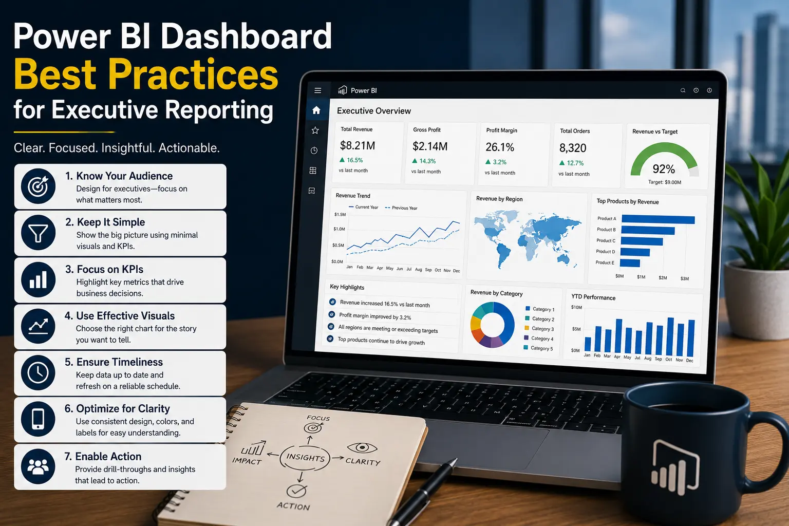
KPI Dashboard Design: 12 Best Practices
A KPI dashboard should make performance visible, measurable, and actionable. For SMB leaders, the goal is not more charts. The goal is a clearer view of the numbers that drive decisions.
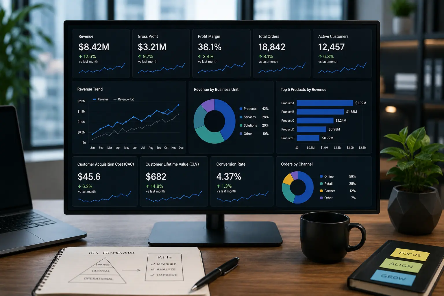
What a KPI dashboard should do
A KPI dashboard tracks the metrics that matter most to a business process, department, or leadership team. It should show whether performance is on track, where problems are developing, and what needs attention.
The most common mistake is treating a KPI dashboard as a place to put every available metric. A useful dashboard is more selective. It connects metrics to responsibility, targets, trends, and actions.
For an SMB, KPI reporting may cover sales, finance, operations, delivery, inventory, customer service, or marketing. Power BI can bring those metrics together, but the design still needs business discipline. Clear KPI definitions matter as much as the visual layout.
KPI dashboard best practices
1. Start with decisions, not data
Ask what decisions the dashboard should support. A sales manager may need pipeline risk. A finance leader may need margin variance. An operations manager may need backlog exceptions. The data follows the decision.
2. Define each KPI in plain English
Every KPI should have a definition that a business user can understand. Define the formula, filters, exclusions, update frequency, and owner. This prevents meetings from turning into debates about what the number means.
3. Include targets or thresholds
A KPI is more useful when it is compared with a target, budget, service level, prior period, or threshold. Without context, a number does not tell users whether action is needed.
4. Separate strategic KPIs from operational metrics
Strategic KPIs show overall business health. Operational metrics explain process behavior. Mixing both without structure makes the dashboard hard to read.
5. Use trends to show direction
A current value may hide improvement or decline. Trend lines, rolling averages, and variance views help users understand whether performance is stable, improving, or deteriorating.
6. Highlight exceptions
The dashboard should direct attention to the areas that need action: products below margin target, customers with falling orders, locations with high labor cost, or projects over budget.
7. Keep filters simple
Filters should match how users think about the business: date, region, location, product, customer segment, or department. Too many slicers create confusion and slow reports.
8. Design for the main user group
A CEO dashboard, finance dashboard, and operations dashboard should not look the same. Each group needs different context, detail, and drilldown.
9. Avoid visual clutter
Use clear labels, consistent formatting, and enough spacing. Avoid decorative visuals that do not improve comprehension. KPI reporting should be easy to scan.
10. Make drilldown intentional
Users often need detail, but the summary dashboard should stay focused. Add drillthrough pages, detail tables, or linked reports for investigation.
11. Protect performance
Slow KPI dashboards are ignored. Good Power BI dashboard development considers model size, DAX design, visual count, refresh strategy, and source system limitations. See our guide to Power BI optimization for more detail.
12. Review KPIs as the business changes
KPI dashboards should evolve. A metric that mattered during early growth may become less useful later. Schedule periodic reviews so the dashboard stays aligned with business priorities.
KPI dashboard design comparison
Practical KPI dashboard examples
Sales KPI dashboard
A sales dashboard may track bookings, pipeline value, win rate, average deal size, sales cycle length, and new customer revenue. The dashboard should show trends and highlight pipeline risk, not just totals.
Operations KPI dashboard
An operations dashboard may track throughput, on-time delivery, backlog, labor utilization, service tickets, or inventory exceptions. Managers need fast exception views that point to the locations or processes needing attention.
Finance KPI dashboard
Finance KPI reporting may include revenue, gross margin, operating expenses, cash, receivables aging, budget variance, and profitability by segment. The design should support monthly review and action planning.
If the current reporting process relies on recurring spreadsheet work, our guide to automated business reports explains how to reduce manual effort. If your data is spread across many systems, the article on databases vs data warehouses may help clarify the foundation.
Need a KPI dashboard your team can trust?
Willduet helps businesses with Power BI dashboard development, KPI reporting, reporting automation, and BI implementation support.
Conclusion: kpi dashboard
A kpi dashboard is valuable when it gives the business a clear view of performance and the confidence to act. Strong KPI dashboard design starts with decisions, uses clear definitions, adds targets and trends, highlights exceptions, and keeps the model reliable. With the right Power BI implementation and governance, KPI reporting can become part of daily management instead of another manual reporting task.
Frequently asked questions
What is a KPI dashboard?
A KPI dashboard is a reporting view that tracks the key performance indicators a business uses to monitor progress, identify risk, and guide decisions.
How many KPIs should be on a KPI dashboard?
Use only the KPIs needed for the dashboard's purpose. A leadership dashboard may need a small set of strategic measures, while an operations dashboard may include more detailed process metrics.
What makes a KPI dashboard useful?
A useful KPI dashboard has clear definitions, targets, trends, owners, filters, exception views, reliable refreshes, and a layout built around business decisions.
Should KPI dashboards include tables?
Tables are helpful for detail, but they should support the KPI story rather than dominate the dashboard. Use detail pages or drillthrough when the table is too large.
Can Power BI be used for KPI dashboards?
Yes. Power BI is a strong option for KPI dashboards when data modeling, refresh, security, and dashboard design are handled properly.
Who should define KPIs?
Business owners should define KPI meaning and targets. BI or data teams should translate those definitions into reliable measures, models, and dashboards.