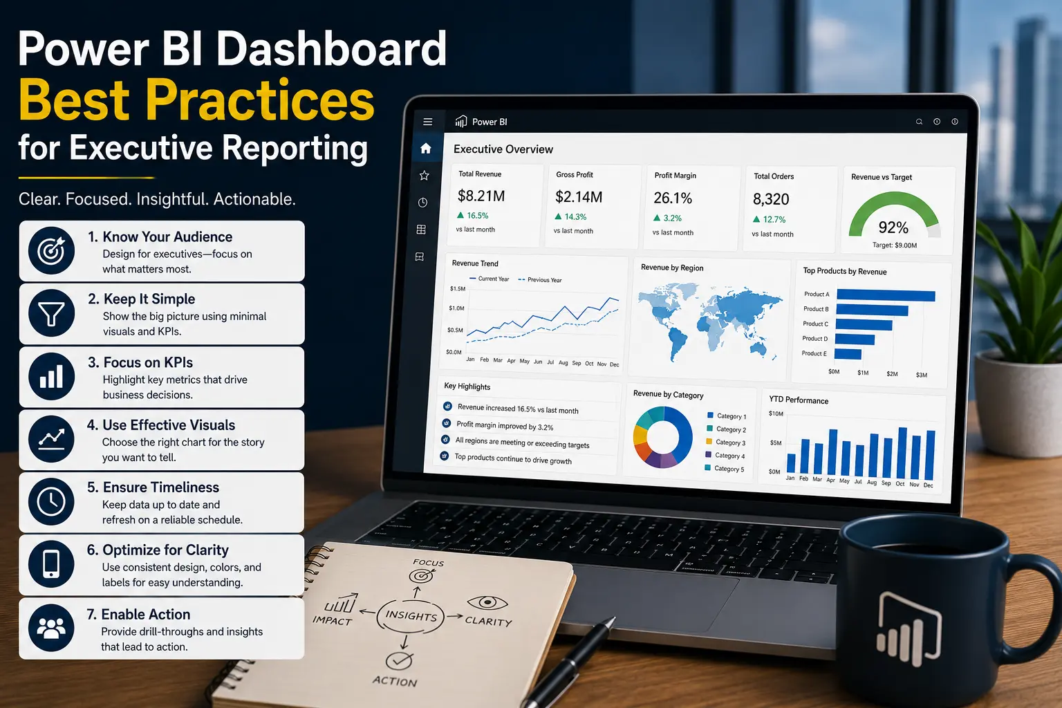
Executive Dashboard Design Best Practices
An executive dashboard should help leaders understand business performance quickly, not force them to decode a dense report. The best designs combine focused KPIs, clean context, and trusted data.
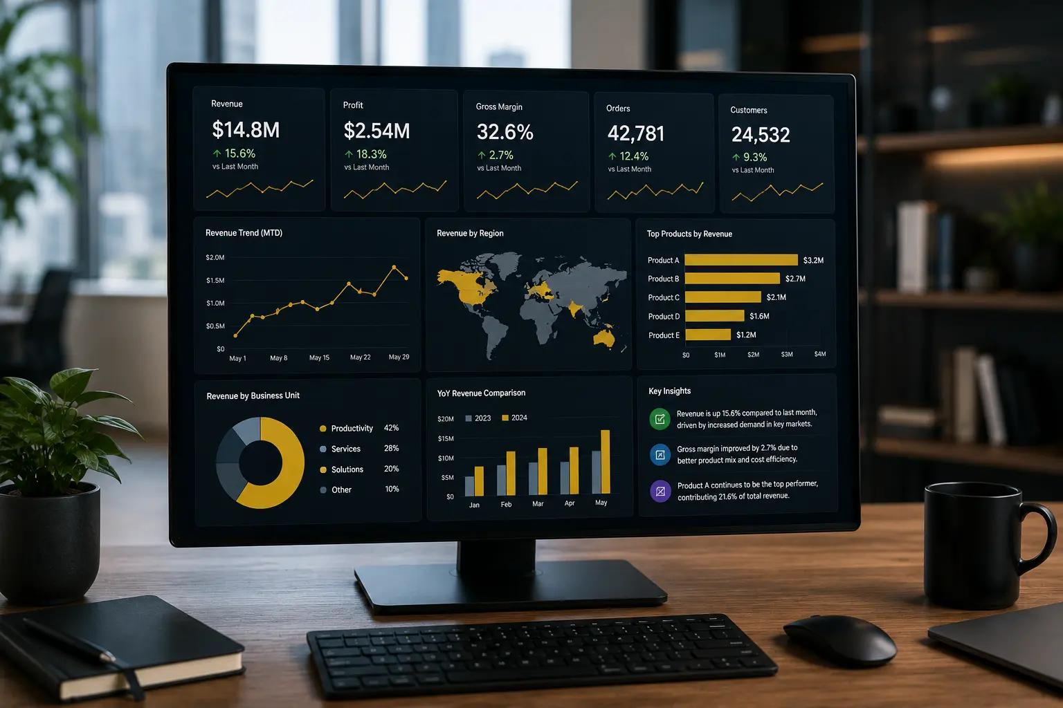
Executive dashboard design starts with decisions
An executive dashboard is not a collection of attractive charts. It is a decision tool. It should help leadership see whether the business is on track, where attention is needed, and which questions deserve follow-up.
The starting point is not the data source. It is the management rhythm. Will the dashboard be used in a weekly leadership meeting? A monthly finance review? A daily operations check-in? A board update? The answers influence KPI selection, refresh frequency, layout, and the level of detail.
For an SMB, executive reporting often needs to bring together finance, sales, operations, and service data. That means the dashboard design must balance simplicity with enough context to prevent misleading conclusions. Revenue without margin can hide unprofitable growth. Sales pipeline without conversion rate can overstate future performance. Operations volume without capacity can miss delivery risk.
Executive dashboard best practices
1. Limit the dashboard to decision-critical KPIs
Executives need focus. A dashboard with thirty metrics usually creates more questions than clarity. Start with the few measures that indicate health, risk, and progress against strategic priorities.
- Revenue, gross margin, cash, or profitability for finance.
- Pipeline, bookings, win rate, or customer retention for sales.
- On-time delivery, backlog, utilization, or service level for operations.
- Customer satisfaction, churn risk, or support volume for customer teams.
2. Show performance against a target
A KPI without a target is only a number. Leaders need to know whether performance is good, bad, improving, or falling behind. Use targets, budgets, prior periods, forecasts, or thresholds to add meaning.
3. Design the top row for scanning
The first screen should answer the most important question: are we on track? Use summary KPIs at the top, then supporting trends, exceptions, and detail below. Avoid making executives scroll before they understand the current state.
4. Use trends before tables
Tables are useful for detail, but leadership dashboards usually need trends first. A revenue number is more useful when leaders can see whether it is rising, falling, seasonal, or unusually volatile.
5. Make exceptions obvious
Executive dashboards should highlight areas that need attention: locations below target, customers at risk, projects over budget, products with margin pressure, or departments with unusual spend.
6. Keep drilldown available but separate
Executives may need detail, but the main dashboard should not become a detail dump. Use drillthrough pages, linked reports, or filtered detail sections so users can investigate without cluttering the executive view.
7. Protect trust with definitions
If leadership disagrees on what a KPI means, the dashboard will not be trusted. Document definitions for revenue, active customers, churn, margin, utilization, backlog, and any metric used in management decisions.
Strong vs weak executive dashboard design
Practical SMB executive dashboard examples
Owner-operated services business
A services company may need a dashboard covering revenue, margin, utilization, overdue invoices, pipeline, and project delivery risk. The executive dashboard should not list every project task. It should show which business areas need attention this week.
Multi-location operations business
A business with several locations may need sales, labor cost, service volume, customer complaints, and inventory risk by location. The executive view should rank locations by exceptions so leadership can focus on action.
Finance-led management reporting
A finance leader may need monthly actuals vs budget, cash position, margin trend, expense variance, and receivables aging. For more on reducing manual reporting work, see our article on automated business reports.
Data and governance matter as much as design
A clean layout cannot fix weak data. Executive dashboards need reliable data sources, documented transformations, refresh monitoring, and agreed KPI definitions. If the dashboard pulls from spreadsheets that are manually edited every week, the design may look modern while the process remains fragile.
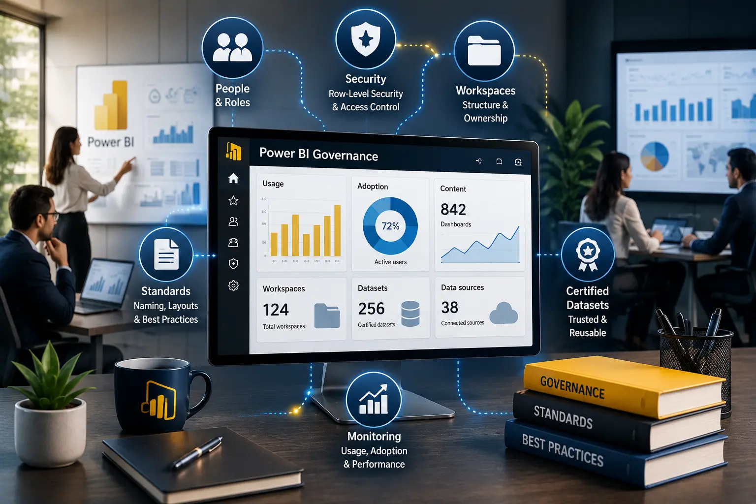
Power BI dashboard development often benefits from a governed model. A shared model ensures that finance, operations, and sales reports reuse the same definitions where appropriate. For broader reporting controls, review our guide to Power BI governance and Power BI security best practices.
Performance also affects adoption. Executives will not wait for a slow dashboard in a leadership meeting. If an existing report is sluggish, the issue may be model design, visual complexity, DAX, DirectQuery, or refresh strategy. Our Power BI performance optimization guide covers practical fixes.
Need an executive dashboard leaders will actually use?
Willduet helps businesses design Power BI executive dashboards, KPI reporting, reporting automation, and BI implementation foundations.
Conclusion: executive dashboard
An executive dashboard should make business performance easier to understand and act on. The best dashboards focus on decision-critical KPIs, show targets and trends, highlight exceptions, protect KPI definitions, and give leaders a trusted path from summary to detail. When the data model and governance are strong, executive reporting becomes a management tool rather than another reporting chore.
Frequently asked questions
What should an executive dashboard include?
An executive dashboard should include the most important KPIs, trend context, exceptions, targets, ownership, and enough detail to guide follow-up without turning the page into an operational report.
How many KPIs should an executive dashboard have?
There is no universal number, but most executive dashboards work better with a small set of decision-critical KPIs than with every metric the business tracks.
Should executive dashboards be real time?
Only when the decision requires it. Many executive dashboards are more useful with reliable daily, weekly, or monthly refreshes than with fragile real-time feeds.
What makes an executive dashboard fail?
Common causes include unclear KPI definitions, too many visuals, weak data quality, slow load times, missing context, and no agreement on how leaders will use the dashboard.
Can Power BI be used for executive dashboards?
Yes. Power BI is well suited for executive reporting when the data model, KPI definitions, security, layout, and refresh process are designed carefully.
Who should own an executive dashboard?
Business leaders should own KPI meaning and decision requirements. BI, finance, operations, or IT teams may own the data model, dashboard development, security, and support process.